CLIENT: Arity
ROLE: XP Product Design
THE CHALLENGE
Leverage existing technology to solve a need in the driving space.
Arity developed the ability to track driving trips and calculate the true cost of a trip based on data such as wear and tear on a vehicle, real time gas costs, etc. Was there a space in the driving market that could benefit from these data points and what value would this data provide?
First, my XP partner and I did competitive research to see what type of drivers would benefit from knowing this data. We studied apps and interviewed users from Life 360, Gas Buddy, Google maps, and various travel related apps. We initially explored the possibility of creating a road trip buddy. With all of the precise data collected, we could accurately inform someone if a trip would be more cost efficient in a car, train or plane. While this data seemed useful, our interviews indicated that people are creatures of habit and trip planning rarely relied on the minutiae of travel related costs. Often if a person was taking a road trip, it was to see the sights, or visit a well known destination. If they drive to see grandma every Christmas, saving a few bucks because flights happen to be cheaper this year, wouldn’t be enough to sway them out of their routine.
We then started researching newer driving spaces. On demand services like Uber and Lyft as well as delivery services like GrubHub and DoorDash. These drivers were independent contractors and their day to day travel was often tax deductible. Other charges they incur such as snacks for passengers and music subscriptions were tax deductible. What if we could build an app that could not only track all of the mileage they use for work, but all of the other expenses as well?
The Process
Contextual Inquiry
Finding users’ true pain points from interviewing them in their natural environment. Interviews in the field often provide better information due to the user being in a familiar place and having environmental cues when answering questions.
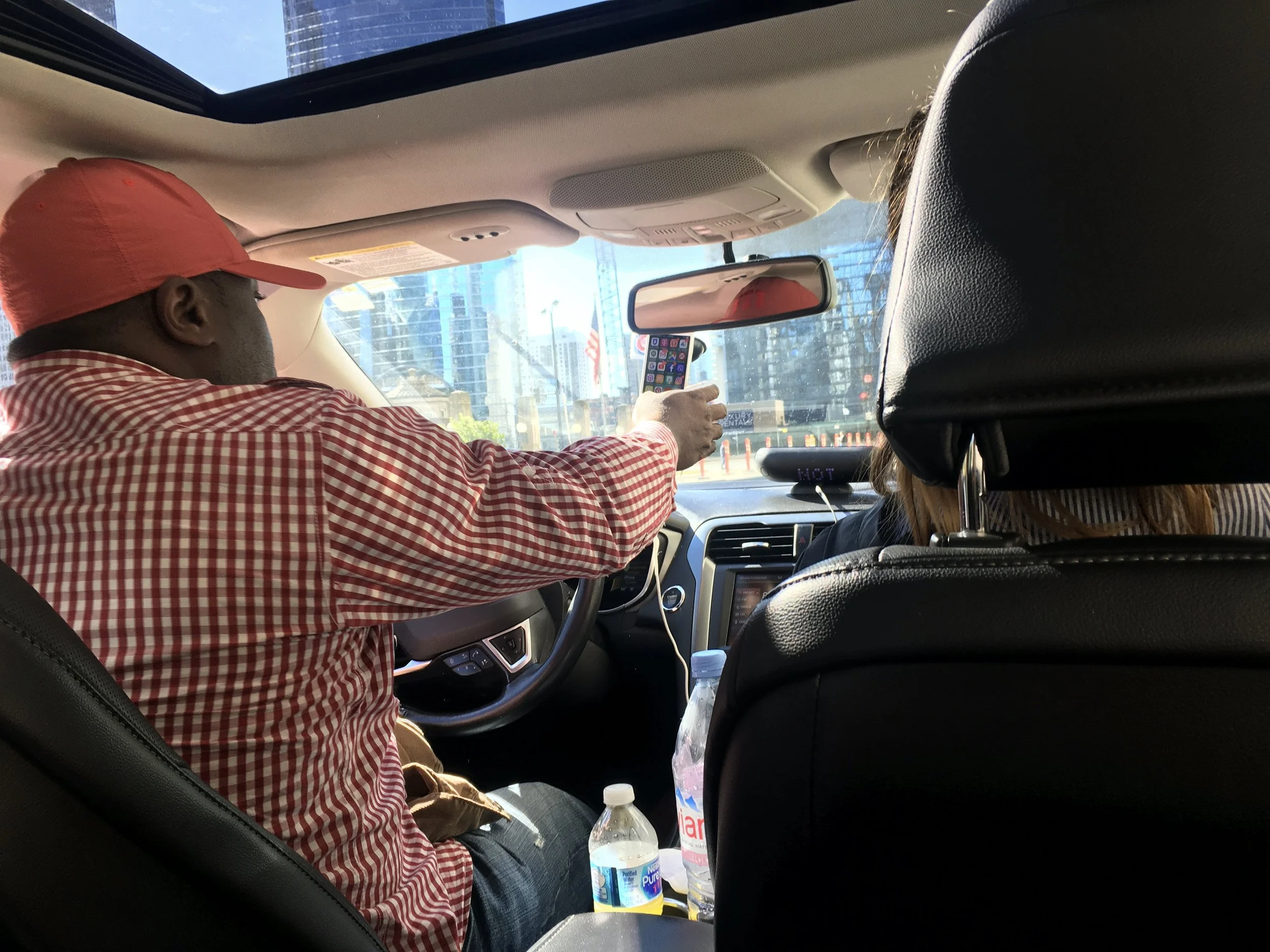
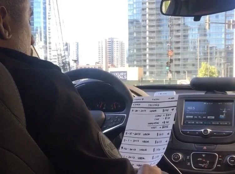
After looking at the current market for mileage tracking for business purposes, we decided the best information we could get would be directly from prospective users. Ordering Uber rides and performing on the spot contextual inquiries provide us with a clearer picture of the space. We learned that most users were unsure of what expenses qualified for tax deductions, how much money they should be saving for taxes, and were unsure that they were actually making any profit after the expenses. Sadly, we found that some drivers assumed that they were full time employees and the fees that the rideshare/delivery companies were deducting from their pay included taxes. They were unaware that they would owe money come tax time.
After synthesizing data we gleaned from contextual inquiries, we formed proto-personas and storyboards. We used LUMA techniques with practitioners in several different areas of the company in order to get as many viewpoints as we could. We settled on three common painpoints to tackle.
Help users track all deductible mileage seamlessly and without any extra cognitive load. We wanted the app to run in the background and give users peace of mind that they were collecting the data they would need to hand over to H&R Block at the end of the year.
Give users a way to keep track of expenses incurred while driving. We wanted a space in the app to be solely for collecting receipts for things drivers could deduct. Snacks, car washes, maintenance etc.
We wanted a running tally of how much money the drivers were saving through deductions, and how much they should be saving for taxes at the end of the year.
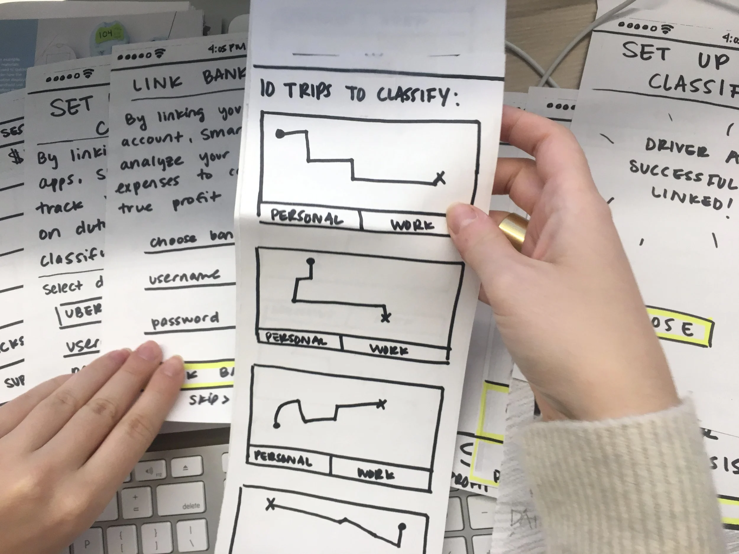
My XP design partner and I then did solo sketching and further ideated on concepts. We came back together and dot voted on the best features between the sketches and began to form a paper prototype. We wanted to really dig deep before going digital, so we made our paper prototype and ordered more Ubers.
Paper prototypes
A way to illicit feedback without users getting distracted by type of device or digital design choices. Quick and easy to iterate on. Users feel more comfortable collaborating on design when the design is marker on paper.
We started A/B testing the two prototypes that we developed.
Each version of the prototype tracked each driving trip and allowed the user to quickly classify each trip as business or personal and kept a tally of business miles and the corresponding deduction that the driver would get from each trip.
Version one was an app that integrated with the drivers’ employment and banking apps. We asked for access to this data in order to add expenses to the tax data without requiring the user to manually enter it. We also wanted to provide a clear picture of what profits the drivers were seeing. By integrating bank and payroll data, we could provide valuable data to the user and collect the data points behind the scenes, without adding to the cognitive load of the user. This version of the app would provide the most value, but through our testing we learned that users didn’t want to give their financial data to an unknown app. They showed more amenability to share that personal data if there was a big financial name attached to the app, such as Quickbooks or Bank of America, but often stated that technology was becoming too invasive and they would prefer to keep that information confidential.
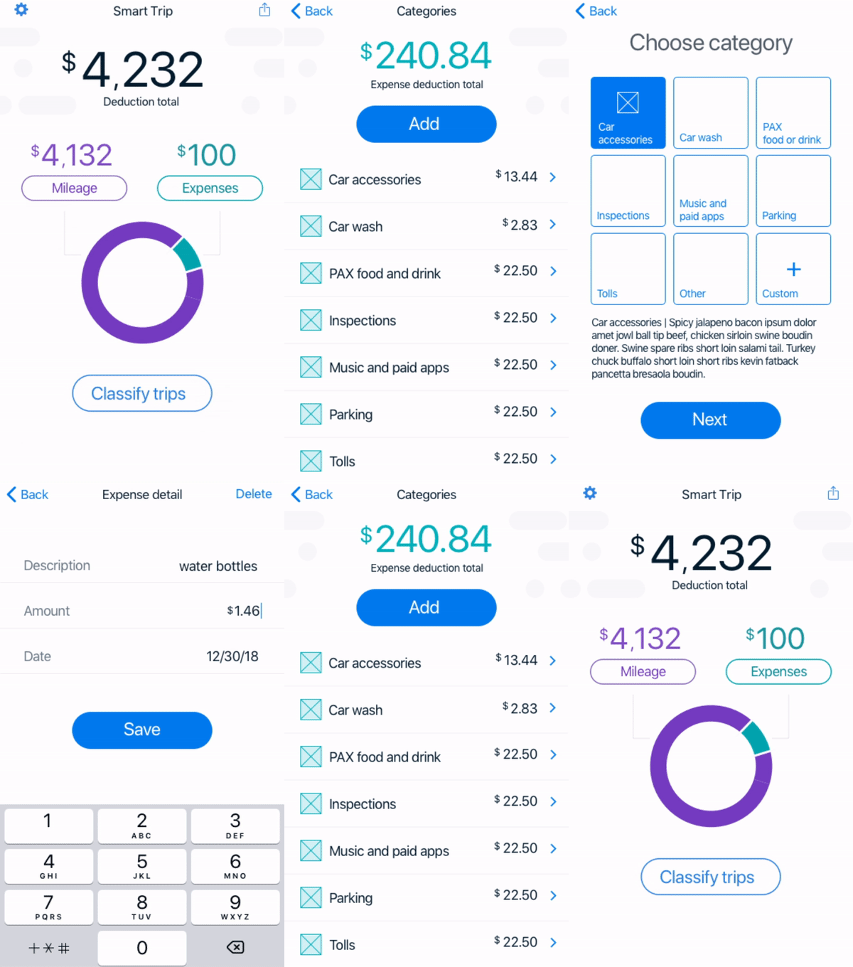
Version two of the app allowed the user to manually add expenses and take pictures of receipts. This version was solely focused on tracking mileage and expenses for tax purposes. Without the ability to integrate with the drivers’ financial data, there wasn’t a clear way to calculate income vs expenses. The feedback on this version of the app was much more positive, and felt like a good MVP. Profit calculating and third party app integration could always be added in later iterations.
A/B Testing
Testing more than one iteration of an idea can lead you in the direction of the true user need. Giving a wide variety of features can help pinpoint what problem really needs solving.
After synthesizing research from our paper prototypes, we took them into Invision and Axure, to create fully functioning digital prototypes that could be tested remotely.
InVision
Digital
Prototype
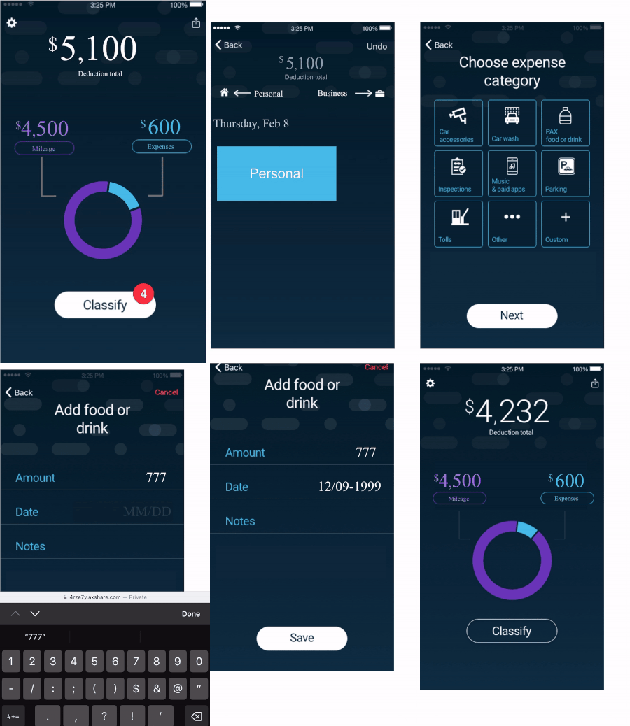
This is an example of a simple “Add Expense” flow from the digital prototype created in Sketch/InVision. We used InVision to create a quick prototype that could be tested immediately,
Axure Digital
Prototype
We created a higher functioning prototype in Axure to test specific functionality such as “Swipe to Classify.” Axure prototypes take more time to create but are great for testing specific functionality.
Insights from interviews and prototype testing
Rideshare apps had perviously used a “Swipe to Accept Ride” feature. It was despised by users because it is difficult to swipe while driving and it caused users to unintentionally accept or miss rides that were offered to them. Although we didn’t expect users to use this functionality while driving, the reaction it invoked made it clear that we should use a different type of interaction for classifying trips.
When testing the swipe to classify feature, we wanted it to be intuitive. We used a bounce on the first trip card to indicate that the trips were swipeable. We learned that users don’t watch the screen while app loads and often missed the bounce cue.
Rideshare drivers typically only drive for one to two years. Many mistakenly assumed that they were W2 employees and that their income tax was being deducted by the rideshare companies as part of their fees. Of the people we talked to that had previously done taxes with rideshare income, we learned that many were either estimating their expenses and mileage. We also learned that Turbotax has an audit meter that estimates your likelihood of being audited based on the data you enter. Drivers were added expenses up to the point of their risk comfort. One driver said “I add expenses until the audit meter turns yellow, and I’ve never had a problem.”
Users didn’t struggle with navigation. Because our app was very specific in functionality, we wanted to know if users would be comfortable with no bottom nav. The MVP functions were classifying trips and adding expenses, so we felt that creating a bottom navigation wasn’t necessary. This proved to be correct through testing although we were aware if additional functionality was added, we would adjust the design to accommodate.
We took our insights into Sketch and created an MVP for production. Working with developers in India, we were able to launch the MVP in 2018. We used Pivotal tracker and Zeplin to communicate with developers, and QA as well as hand off assets.

