CLIENT: Yolobe
ROLE: UX RESEARCH AND DESIGN
The Challenge
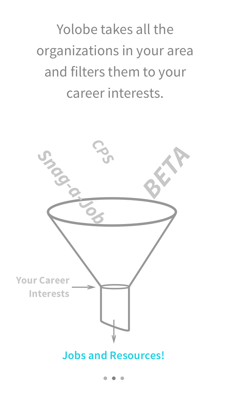
Roughly 67% of high school students aren’t seeking a higher degree after graduation. Although there are community resources and alternative education programs available, there isn’t a platform for these teens to reach services that provide guidance. Yolobe is a mobile application connecting teens to networks that assist in finding careers. We were tasked with producing a clickable prototype that teens would want to use.
SPRINT 1
The Approach
A clickable prototype existed, but Yolobe was extremely unhappy with it. We made a research plan that included a whiteboarding session with the stakeholders, and interviews with students and education experts. We also planned usability testing with the current and future versions of the prototype.
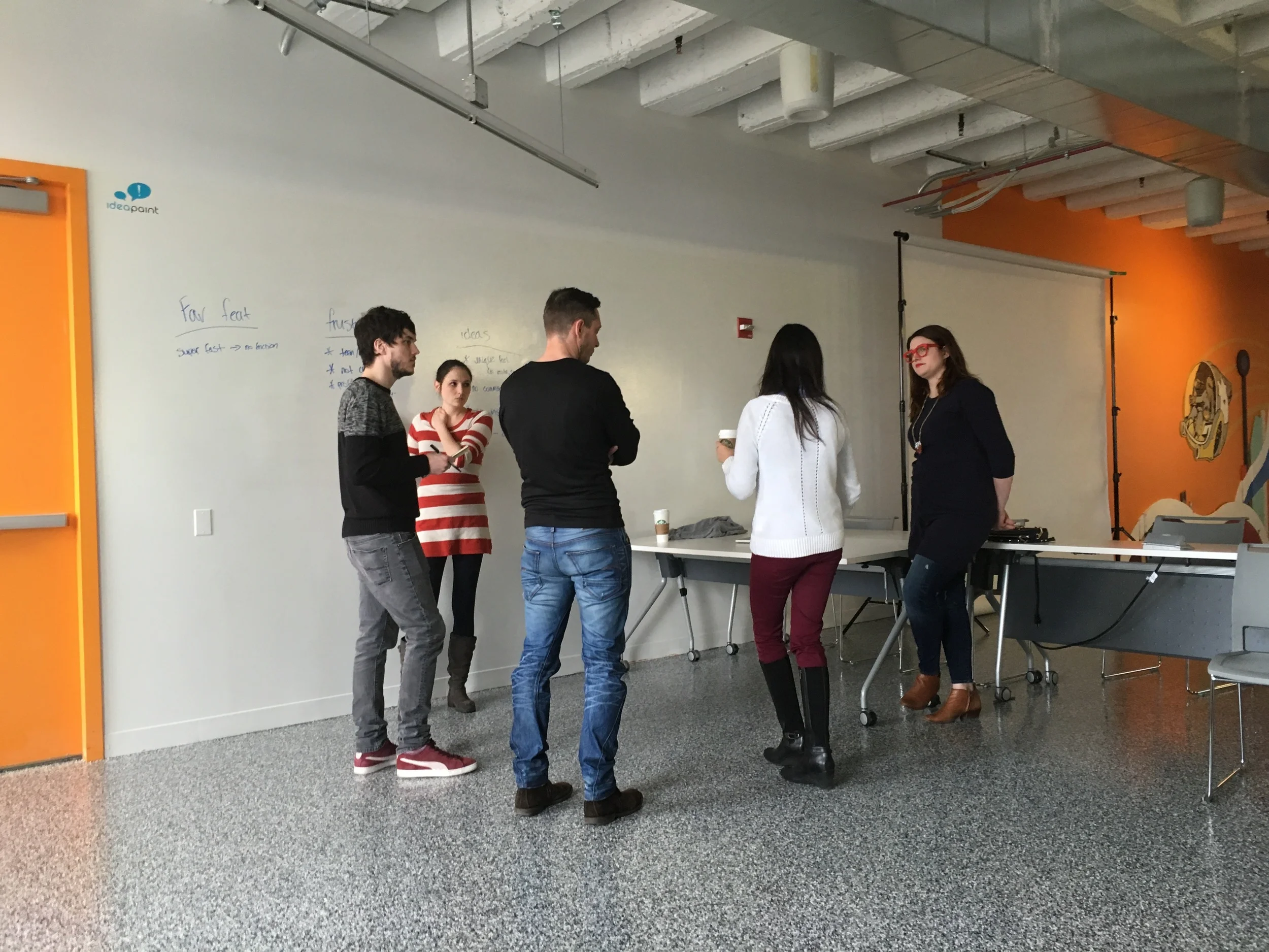
The Whiteboarding session
While facilitating a white boarding session with the stakeholders, I learned the major needs and frustrations they were facing with the process of creating the app. It was very successful and we learned several key insights such as:
- The language on the app needs to be teen friendly.
- It needs a unique feel like instagram or snapchat.
- It needs to be simple to use and have a human feel.
- Students should be able to connect with networks, but not directly with employers or each other.
- Messages that students receive should be personal, and make them feel special.
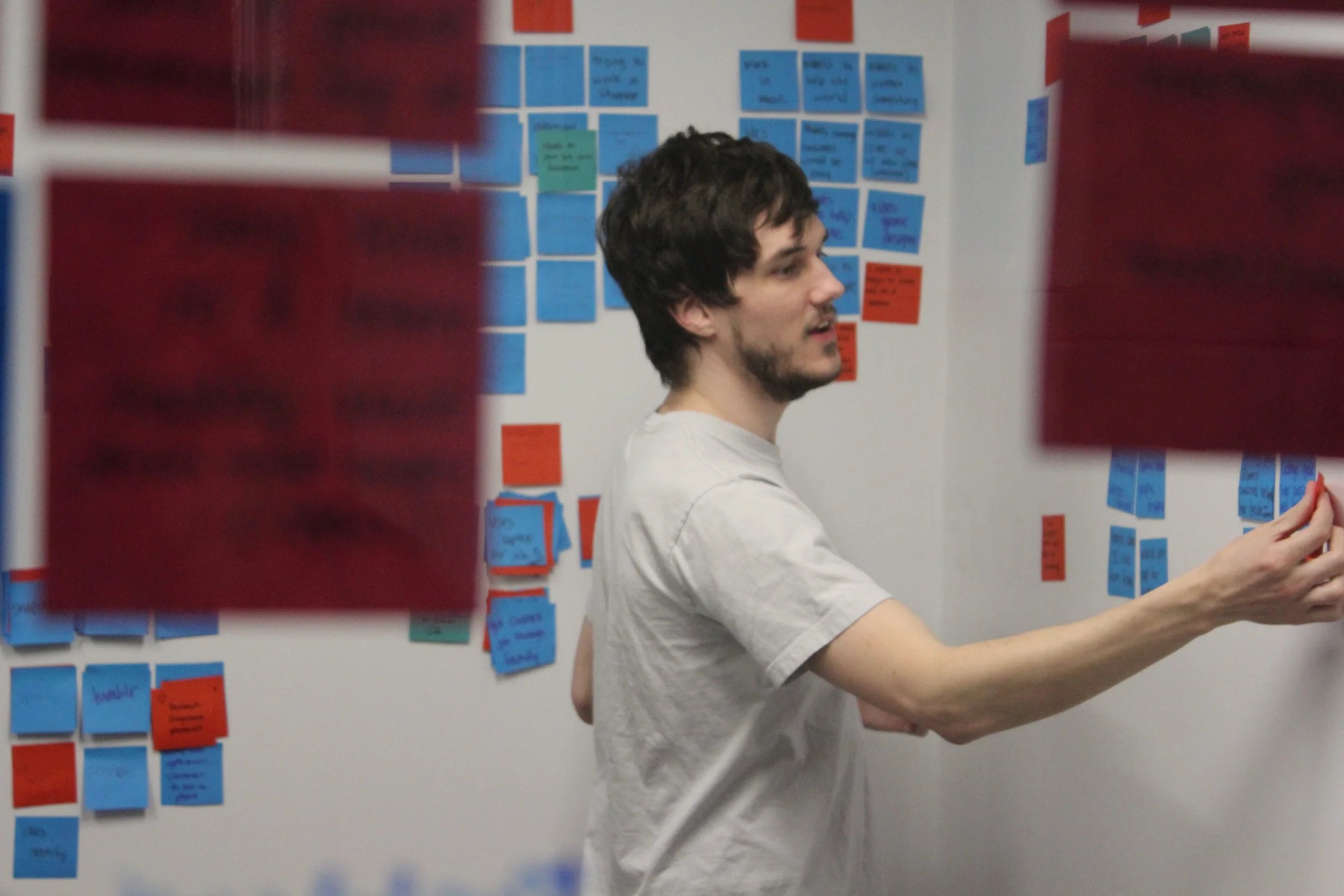
Working on understanding Yolobe better, through a collaborative whiteboarding session.
The research required was focused on graduation rates, social media usage, and things that motivate teens. Doing domain and market research, some key insights we learned were:
- Employed teens are 43% less likely to commit violent crimes.
- There is an issue with transparency among higher education programs.
- Teens don’t understand what value they would receive from completing vocational programs.
- The top apps among teens all involve social media.
- Teens are motivated by things can feel a part of, and where their opinion matters.
- Teens are greatly motivated by incentives, even if they have no value, such as earning a badge in an app.
We conducted interviews with two experts that work with teens. One expert was in charge of a Career Technical Education program. She informed us that there was a great lack of communication between high schoolers and administration.
Many opportunities that were available in the community were going unfilled due to lack of applications. She felt strongly that the students weren’t applying for these opportunities because they were not checking their school email.
Another expert we interviewed ran Lawrence Hall. He informed us that in order to motivate teens, they need consistency and trust.
Wanting to know what made the successful students motivated and unsuccessful students fail, we interviewed students from both extremes. The struggling students had career aspirations that were unrealistic, and had no plan. The students that were succeeding had achievable goals and were working hard to make them a reality.
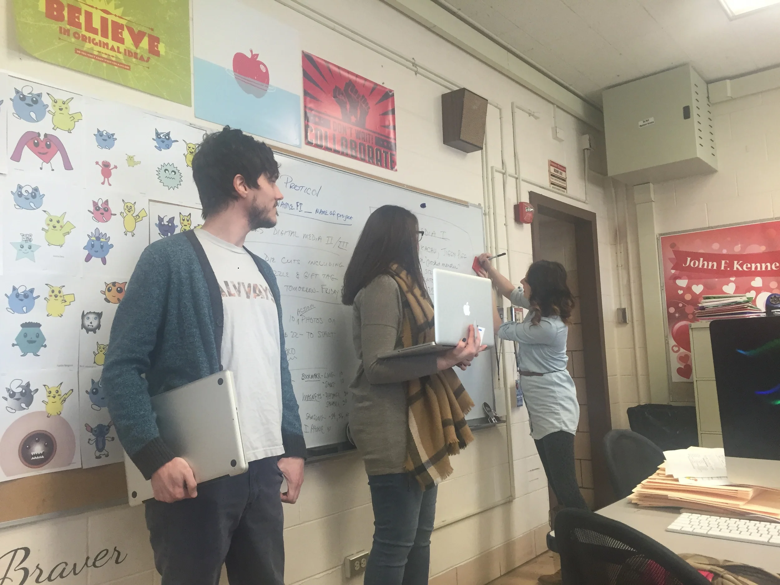
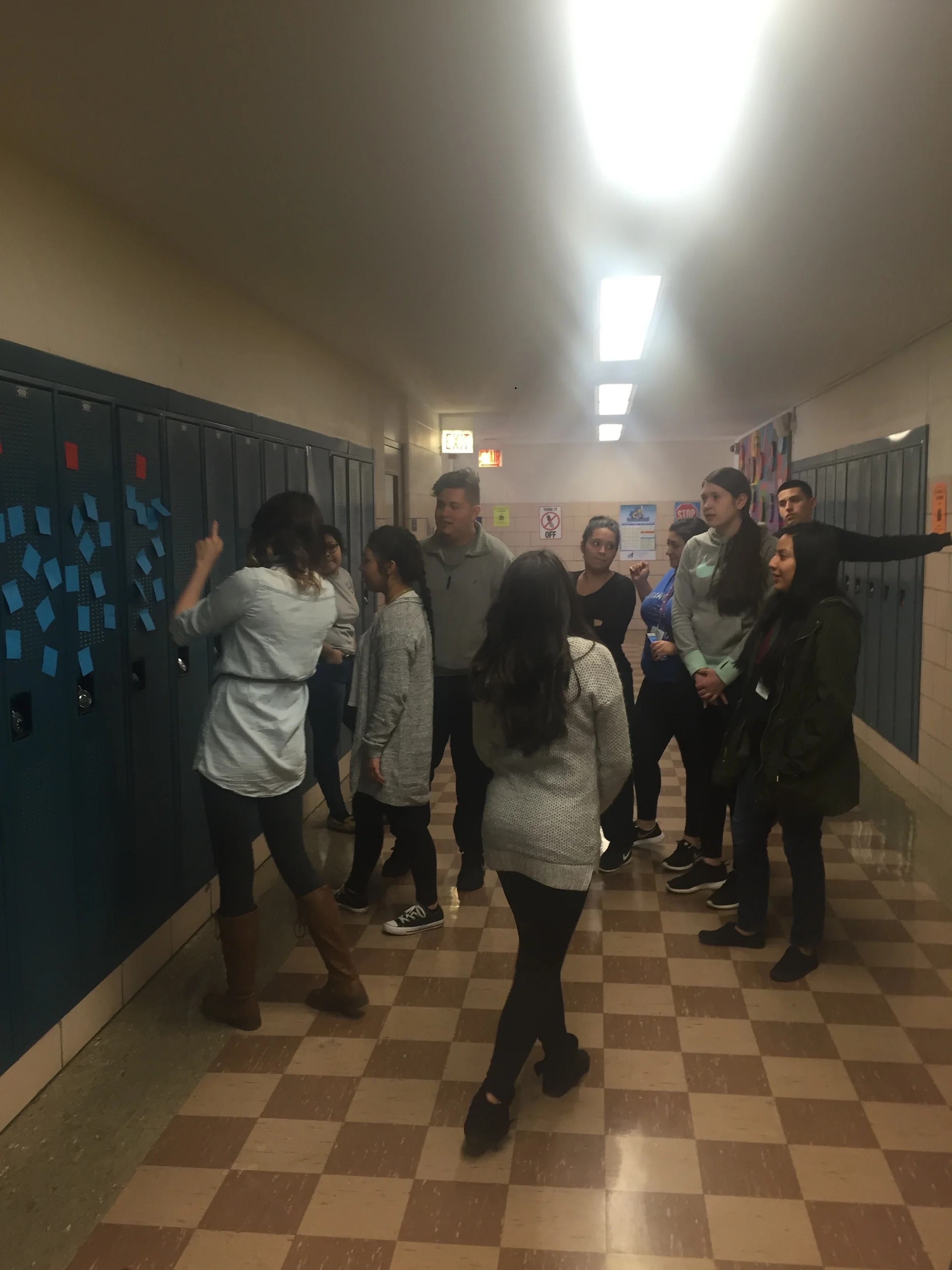
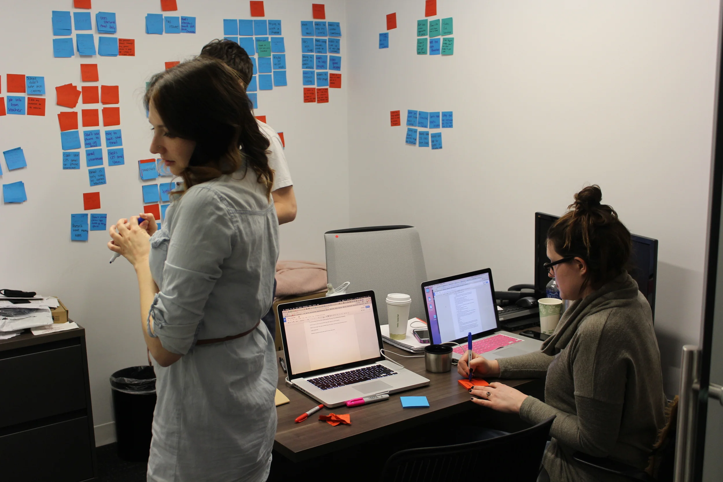
We conducted interviews on-site at a local high school. While two members of the team were interviewing, and card sorting, I was facilitating a class an affinity diagramming workshop with 60 students. The workshop was in line with the researching we were doing, so we used the results of the workshop as part of the data we synthesized.
After the interviews, we started affinity diagramming to see if there were common themes among the successful students versus the unsuccessful students. Based on these insights, we formed a problem statement and a set of principles to guide our designs.
Insights from Interviews:
• Students want to feel like they are a part of something.
• Students interact with their teachers either through face to face meetings, or through email.
• Students use their personal email, but rarely check school email.
• Teens like the highly visual apps (i.e. Snapchat and Instagram.)
• Although the school offers career counseling, students feel that it is college focused.
• Teens need “hand-holding” throughout any important decision making process.
Problem Statement and Design Principles
"Although there are resources available to help high school graduates in moving forward with their careers, there is not an effective way of facilitating communication between the two. Current students as well as graduates are aware of available resources while in school, but most students aren’t utilizing them because relevant information is not being communicated through relevant channels."
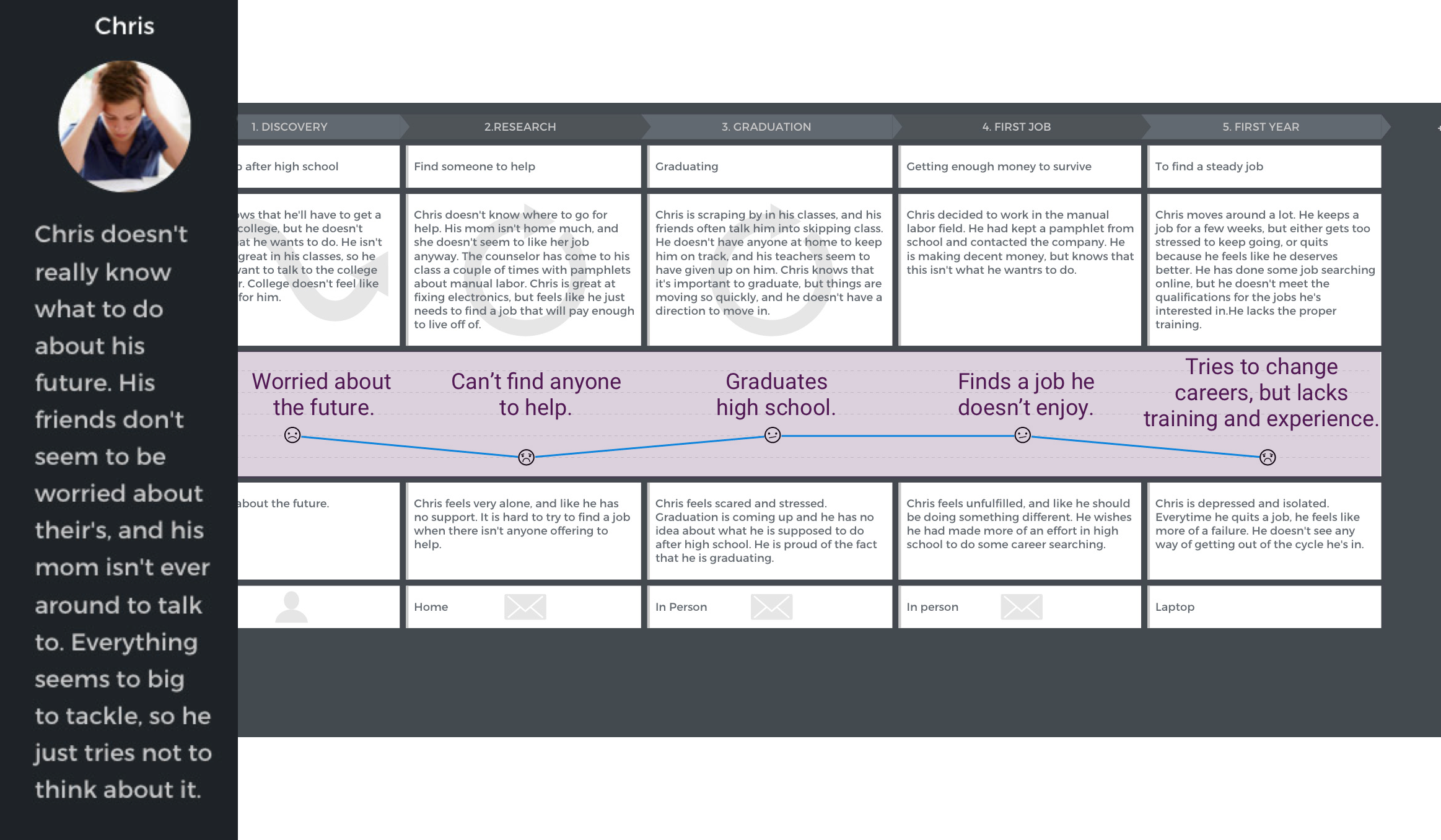
Based on these design principles, we created two journey maps to remind us of the struggles and successes of high school students. Empathy is important when making design decisions, and creating these journey maps was an excellent way to stay connected emotionally.
We collected our research, synthesized data and presented them to Yolobe. Some of our research was surprising and went against initial assumptions.The clients were impressed and surprised by our research but also shared that they were concerned with how we would be able to obtain contact information in a safe way.
SPRINT TWO
Revisiting the competitive analysis, we were able to hone in on the features that were most important.
A highlight of the features we wanted to focus on. These were the features that we felt were most important, yet lacking from the competitors.
Moving into the design phase, we performed three sets of crazy 8s in order to generate several ideas quickly. I wanted to focus on a way to help students find what career they were interested in. When comparing my sketches to the others, the three ideas were unique enough to justify separate wireframes.
We traveled back to the high school and performed usability and preference testing on five high school students. We recorded which features were popular, and what the flaws in each design were.
In my version of the design, students interests would be generated via a career quiz. We used content strategy research to find what questions would be relevant in determining which career would be appropriate for the user. We executed this by prompting the students to take an existing online career assessment quiz. While taking the assessment, I asked which questions were relevant and at what point they got bored with the quiz. By doing this, we had data to determine how many and what type of questions to ask in a career assessment quiz in the app.
Based on the feedback we received from the testing, we iterated our ideas into one paper prototype.
During the second meeting with our clients, we addressed the clients concerns over safety by limiting the amount of information users are able to enter. We addressed the concern over re-engagement by creating a four step path for students to follow in order to get a career. Although the prototype was not what the client had initially envisioned, they trusted our judgement and research, and wanted to see further into the direction we were taking the prototype.
SPRINT THREE
Based on the current prototype we developed a site map and conceptualized key site map screens.
Trying to make the app fit together proved to be challenging. Realizing that we were giving too many options to move around in the app, several options and screens were removed to make the app more streamlined. The interest choices were eliminated, and the career suggestions would now be based solely on quiz results, or by entering a career name.
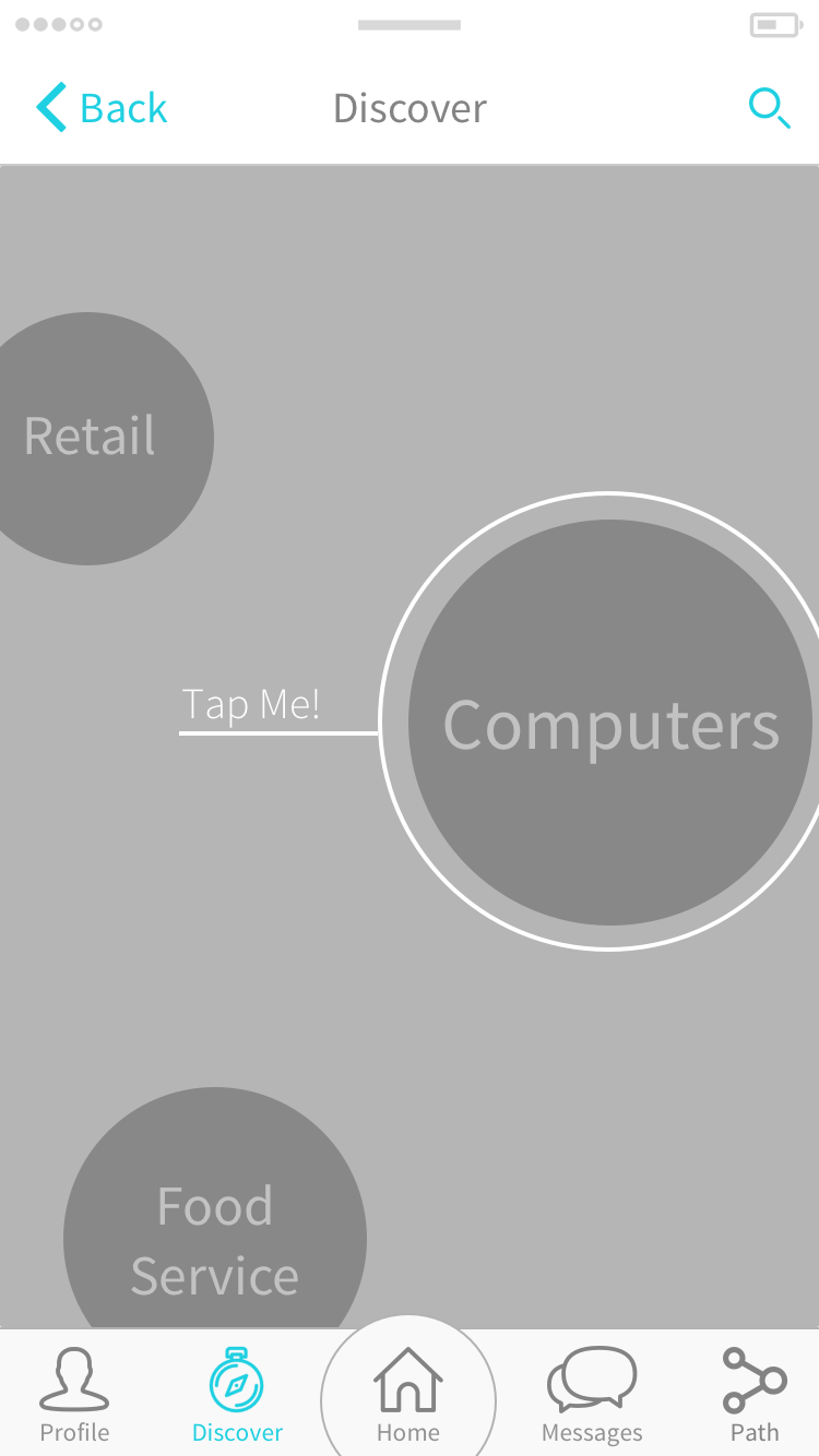
Instead of forcing students to sign up immediately, we created a discover option which would allow the user to explore career options based on different categories and explaining careers using a visually pleasing infographic.
Working once again with students at a high school, we were able to determine what final adjustments needed to be made in our final prototype. The quiz, which was written in a fun Buzzfeed quiz style was very popular. Students enjoyed the discovery option, and the path getting to the career networks was clear. The usability testing was a success and we felt that we had not only addressed the necessary concerns, but we had done it in a fun and teen friendly way.
Prototype: https://invis.io/GJ6BIK8BC
CONCLUSION
My major contribution was the career assessment quiz. It was difficult to take a dry, likert scale quiz and turn it into something fun and engaging. Feedback from the students was invaluable, and the on-site interviews gave me incredible insights into the creation of a relevant and engaging assessment. Without the in-person feedback, I feel like the assessment tool may have had validity and reliability issues.
This project was by far the most challenging that I have been a part of so far, but it was also the most rewarding. I was able to participate in new and exciting research methods, and learned the value of working with potential users in their natural environment.
Because of the research done by me and my team, Yolobe now how has a solid platform from which to make a successful app. I’m excited to see where the app goes, not only because of my personal involvement in it, but also because the population for which it serves is in desperate need for it’s existence.
