CLIENT: HCSC
ROLE: XP Product Design
THE CHALLENGE
Research the current mobile app state and discover what features are currently being used, what pain-points exist, and what features should come next.
The BCBS mobile app had been out for several years and it was time for a new research phase. We needed to find out what was working, what wasn’t and what was missing.
The Process
User iNterviews
Talking to users is the most important source of information to use when designing user centered experiences. We conducted 10 in-person interviews that included usability testing of the app in it’s current state.
We assessed the current state of the BCBS Mobile App to gain a better understanding of our members expectations. We wanted to:
Identify members comprehension of their healthcare plan
Understand members expectations of the application’s features
Investigate what management tools are beneficial for long-term care
Assess usability of newly implemented features
Gain insight on how the average member manages their prescriptions
What we heard
““If it is confusing I ask people. When you look it up it is
too vague. It’s lawyer speak.”
”Healthcare is just over my head. How they bill things,
what’s in network, what goes towards your deductible
and what doesn’t...”
”Let’s just focus on what I need to focus on right now
and not add additional information to my thought
process if I don’t have to.”
”
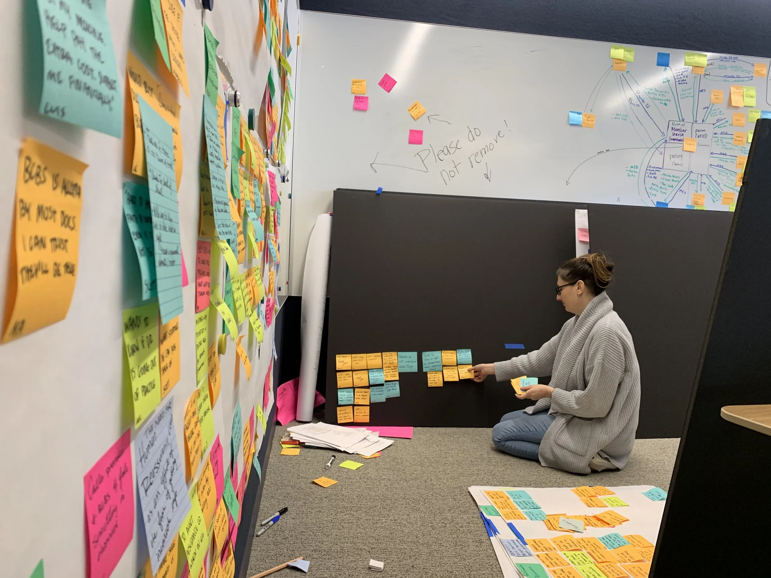
My design partner and I pulled insights from each interview and wrote them on individual post-its. We then clustered them into common findings, arranged and discussed and rearranged. We also looked for reoccurring patterns and identified themes amongst members. We turned themes into overarching statements and looked for compelling points of interest. We also created qualifiers and needs.
Affinity Diagram
My favorite way to synthesize interviews. We took extensive notes from each interview and downloaded our learnings.
Insight Statements
Based on the insight themes we discovered through synthesis of the affinity diagram, we created these Insight Themes that would inform our new design principles.
Design Principles
We took the themes and insights from our synthesis and created Design Principles to drive our future designs.
FOSTER SELF-EFFICACY.
We enable members to be confident in their healthcare choices by providing educational and self-management support. By removing knowledge barriers, members feel empowered to take control of their health.
SPEAK THEIR LANGUAGE.
We present information in a way that is simple, transparent, and easy to digest. We use everyday terms that inspire trust rather than confusion.
ENABLE INTERACTION ON their terms
We serve information that is valuable to them in real-time, reducing cognitive load. We allow members to access information whenever and wherever they want creating dynamic interactions with their insurance in ways that best suit them.
EMPATHETIC TO MEMBERS' NEEDS.
We tailor unique experiences that are accommodating and welcoming because we understand that members are experts in their own lives. Presenting information that specifically appeals to the member enables them to connect with insurance in a meaningful way.
ASSIST MEMBERS TO ACHIEVE OPTIMAL HEALTH.
We perceive members as partners in health. Information shouldn't have to be sought out. We give them the tools and support that they need when they need it to help accomplish their health goals in sickness and in health.
HEALTHCARE EXPERIENCE IS A HUMAN EXPERIENCE.
We guide members with real-life narratives or scenarios to help them understand complicated processes. We enable them to feel understood and cared for by creating an environment that feels familiar to them.
We heard over and over again that members were confused about coverage, networks, and insurance language in general. We needed to help make insurance understandable and accessible. So the things we initially decided to tackle were, an easy way to access copy of the member ID card, information tags to help explain any unclear text on any screen, and a refresh of the “Claims” and “Coverage” screens.
The Deliverables
Claims Refresh
claims page
We designed the claims page to give the most information with the least amount of cognitive load. Simple text, designed with the hierarchy of importance in mind, and with the option to filter. All claims are labeled with a WCAG compliant, easily findable status tag.
Claims Filter
We took each piece of information on the Claims Page and gave it a filter. People with long hospital stays often have many pages full of claims. We wanted the user to be able to find the info they needed when they needed it.
Claim Detail
The “Claim Detail” page gives a deeper dive into an individual claim. There is more information from the claim listed, as well as in info tag at the top. We also placed a link to call and speak with a claims expert at the bottom. Users told us that they wanted their insurance to be accessible, and so did we.
Claim Terms
We really listened to our users when they said they had trouble understanding “lawyer speak.” We worked with copywriters and the legal department to explain each piece of the claim detail in simple language.
Coverage Refresh
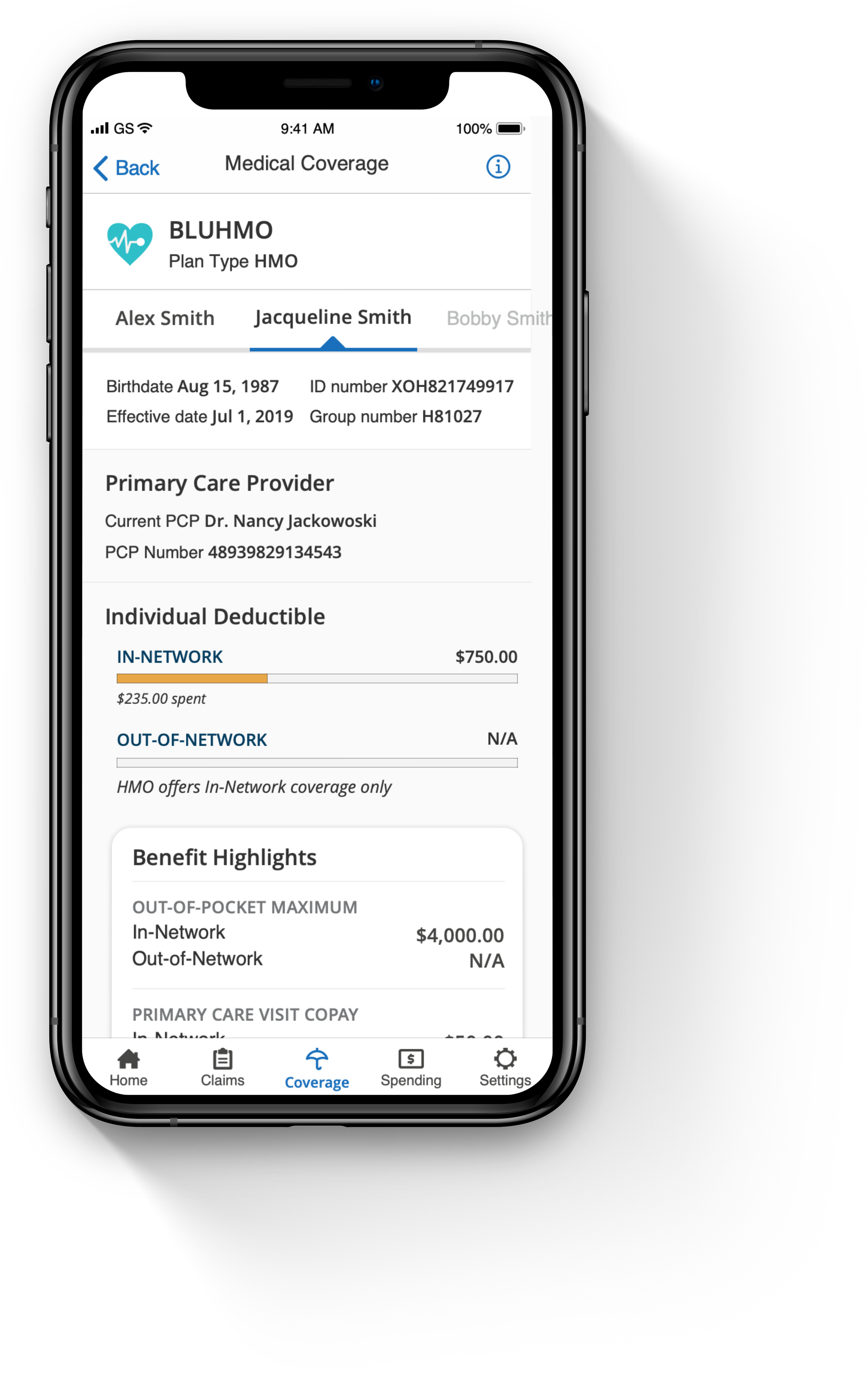
Coverage Page
This page was also designed with information hierarchy in mind. We needed to communicate a lot of data and do so in a way that was easily digestible. We used a simple toggle to allow the user to view various members information.
Benefit Highlights
With the coverage screens, we needed to give as much pertinant information as possible, without over loading the user. We talked to the data team to determine what information users were accessing most. And with a few technical limitations, we were still able to serve the benefit highlights.
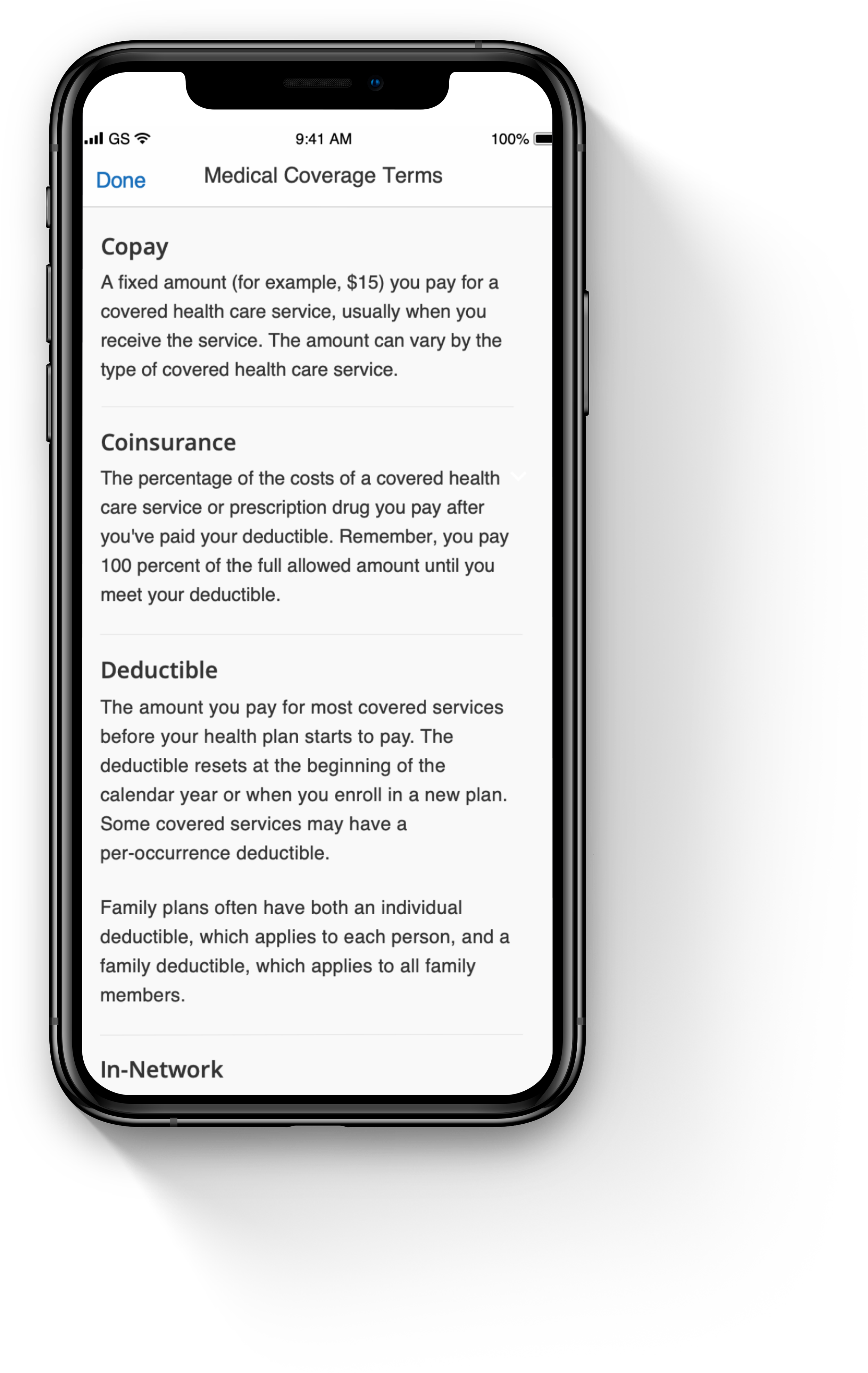
Medical Coverage Terms
My favorite addition to the app. We heard how confused users were with insurance terms, so we made definitions. Insurance is a confusing subject and we decided to use a simple dictionary method to help.
By combining usability improvements with a visual refresh, we were able to increase the NPS score of our mobile app by 4 points. Our research showed that users found the app easier to use and navigate, and they appreciated the new visual design.
One of the key usability improvements was breaking down and reformatting data in a more consumable way, making it more intuitive and reducing the number of steps required to find important information. Additionally, we improved the language in the app and gave users a place to reference terms they may find confusing.
In terms of the visual refresh, we focused on creating a clean and modern design that would appeal to our users, but also helped to highlight important elements of the app.
Overall, the redesign was a great success, and it continues to drive user engagement and satisfaction.


