Project: FLOK
Client: Designation
Role: UI and Branding
The Challenge
I was tasked with creating the UI for a website. Designing a platform for community members to find nonprofits where they could volunteer, my team was focused on the volunteer side. Based on the UX research, making the community better was the main goal of the users. They were looking for nonprofits that were local, and had a calendar in which they could book times to volunteer. The UX team found that important features to include were; a map that could show users the closest nonprofit with volunteer opportunities, a calendar that made it easy to book a time to volunteer, and a way for the site to show how the nonprofits were making a difference in the community.
Three wireframe screens that I worked from.
The Name
As a team, we needed to find a name for the platform that encompassed the theme of coming together to make a difference. Creating several names, we focused on the feeling of community. “FLOK” was ultimately decided on because of it’s connotation with a cooperative group. We used a unique spelling in order to create a brand that was friendly and fun.
Competitive Analysis
I started by researching current UI trends in nonprofit websites. I found that the majority of the sites were using bright colors and bold fonts. Many of the sites were using fonts in all caps and had prominent “Donate Now” buttons. The sites gave a sense of urgency and that they needed immediate support.
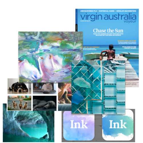
Feeling that the platform we were building needed to have a more easy going and local feel, I decided to go against the trends. Knowing that cool colors give a sense of calm, I decided to start exploring color palettes and pictures that would feel welcoming and friendly feel. I wanted to stay away from colors and pictures that would feel like the nonprofits needed immediate action.
Mood board. I was inspired by cool colors, and the outdoors.
Style Tiles
I began exploring designs that incorporated colors from the mood board. I created three style tiles. Two of the tiles had a modern, and community feel, the third went in a different direction. I decided to try a look that still had a friendly, but had a more vintage feel.
Logo
I wanted to keep with the idea of flocks of animals. The blues and greens of two of the style tiles felt very earthy. I liked the idea of birds, so created several iterations that included birds. I liked the idea of having the logo include birds against a blue background. I also worked on logo ideas that went in a different direction to give some options for the final logo choice. Ultimately I chose the birds on a branch logo for the site.
The logo went through several iterations be I arrived at the final decision.


